
What is the “TIKS Visitor” app?
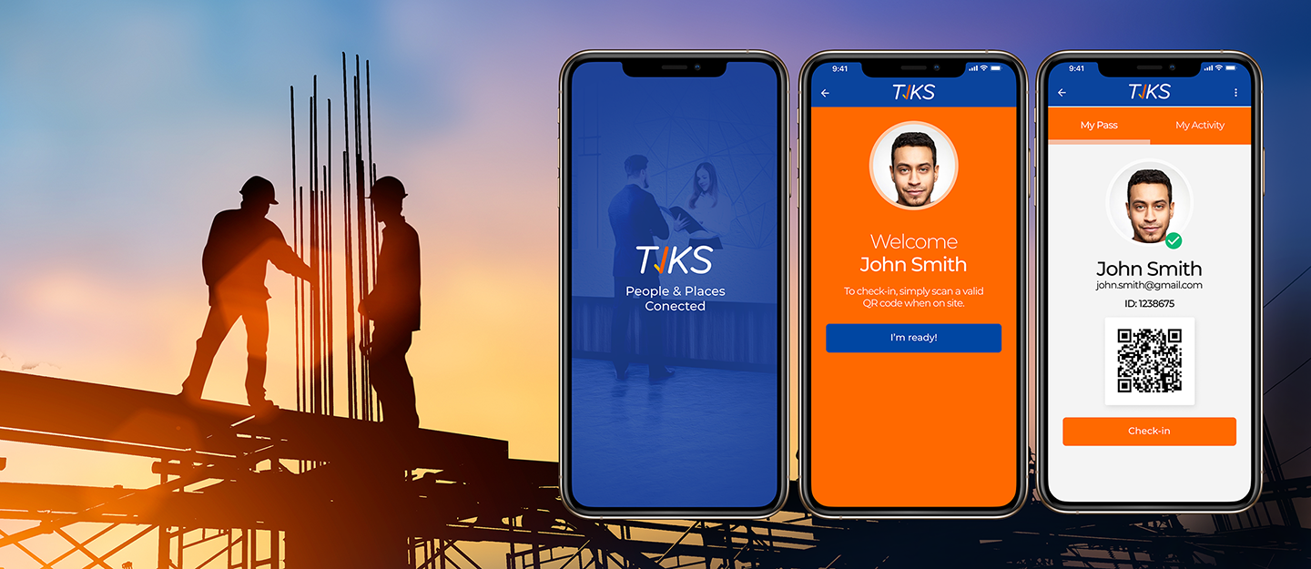
TIKS is a workplace safety and visitor management app. It tracks everyone who enters and leaves sites via recording their name, time and date of entry and exit.
It provides contactless QR code check-in and check-out specially in this climateIt(Covid-19). It also provides a quick and easy way for contractors to get approved to work on-site & helps to ensure visitors, workers and sites are safe and compliant at all times.
Client: TIKS ( Chocolate Coded )
Design Tools: Figma Lucidchart
Duration: 3 Weeks
Deliverables: User Flow, Wireframes, Interactive Prototype, Design Coding
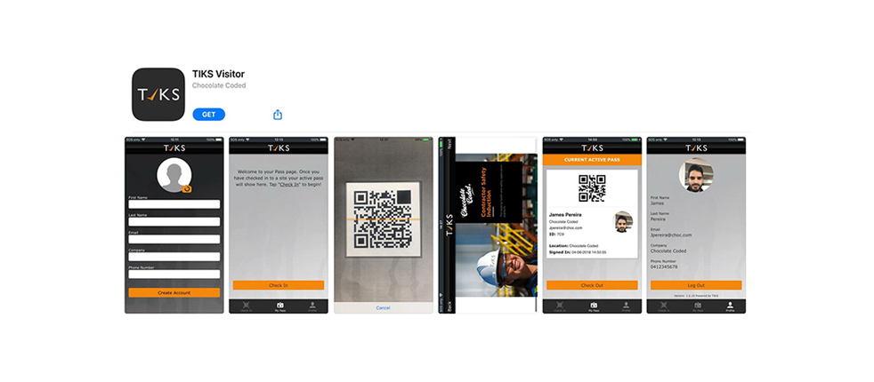
TIKS(Chocolate Coded) company wanted to revamp the user interface of a "TIKS VISITOR” app from the ground up so that the new user interface can be state of the art. Since the previous user interface of the "TIKS VISITOR" app was outdated, there was a strong business need to revisit & renew the user interaction of the app.
Apart from that, there was a new business branding which we needed to apply to this app. That was a pressing priority for the sales team in their presentations
The ultimate goal of this project was improving the overall user experience and functionality of the app via designing & developing a new user interface.
My role in this project was:
• Creating main UI/UX design deliverables of the app such as User flow, Wireframes & Interactive prototype
• Implementing approved design via HTML, CSS & JS
There wasn’t much of a brief to the project. So, I started this project with all the information I gathered in our first kickoff with the product manager. I was asked to simplify the user flow of the app & make it more user friendly. I kept this in my mind in the redesign process. Then I took some time to find out about the goals of the app, all the included features and what company needed to achieve in the new user interface.
These are list of features:
• Check-in and check-out of a worksite with the built-in QR code reader
• Prove you have completed all conditions for working on-site
• Generate an electronic visitor pass
• Tracks your activity on site
• One account Multiple employers
• Reporting incident and hazard and informing entire organisation about ongoing incidents
Unfortunately, in these circumstances, we didn’t have a budget to do user research. However, I did some competitor research to find out about other similar apps.
Some of the competitors that I checked their app:
• Signing App Campain
• Splan
• Arrived
• Visitor Lobby
• Silver Shield
Then I created the user diagram of the old app based on individual screens available inside the app.
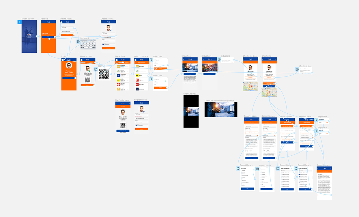
Next, I created my new User flow diagram and defined main routes a user could follow to complete tasks. I tried to avoid any unnecessary steps or screens.
Next, I created a quick & simple wireframe via Figma in order to display the structure of the new app with its interface elements. I made it interactive in the early stage to check if the flow works properly. Then I presented it to the product manager and discussed the design ideas with him and he asked for minor changes.
Before doing the visualization stage, I created a style guide of the elements, spaces, and typeface sizes present in the final product based on our new branding.
For 2 reason I usually create a style guide :
• It helps me to maintain consistency in my design
It is a useful template whenever we want to Implement the design via coding
In this phase, I created the UI of the app via Sketch with all the details and elements. Then I applied the style guide to the design. Next, I build the interactive version of it using Invision to present to the rest of the team.
Unfortunately, We didn’t have a budget to do user testing. However, I did some Guerilla testing internally with non developer colleagues to validate my ideas.
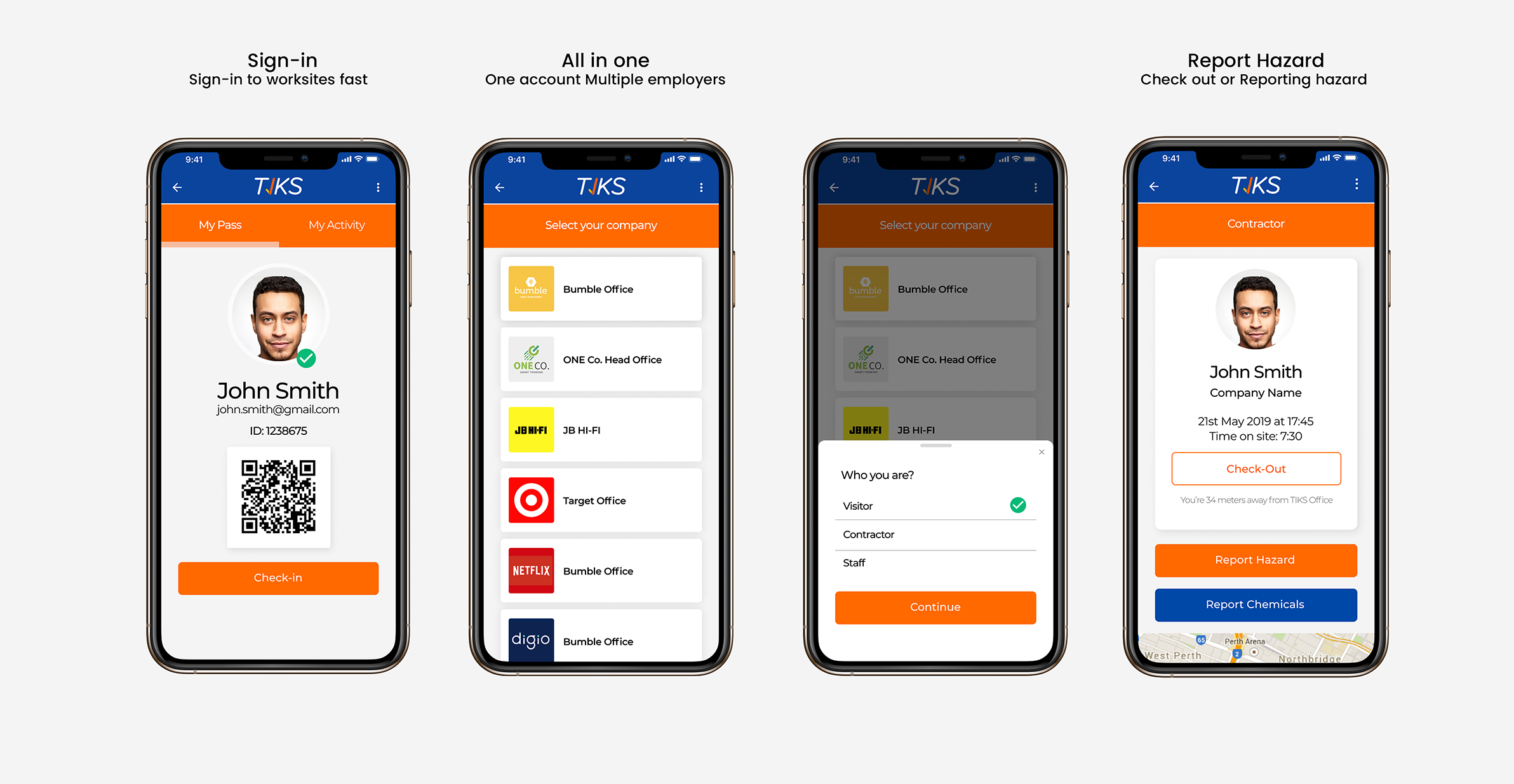
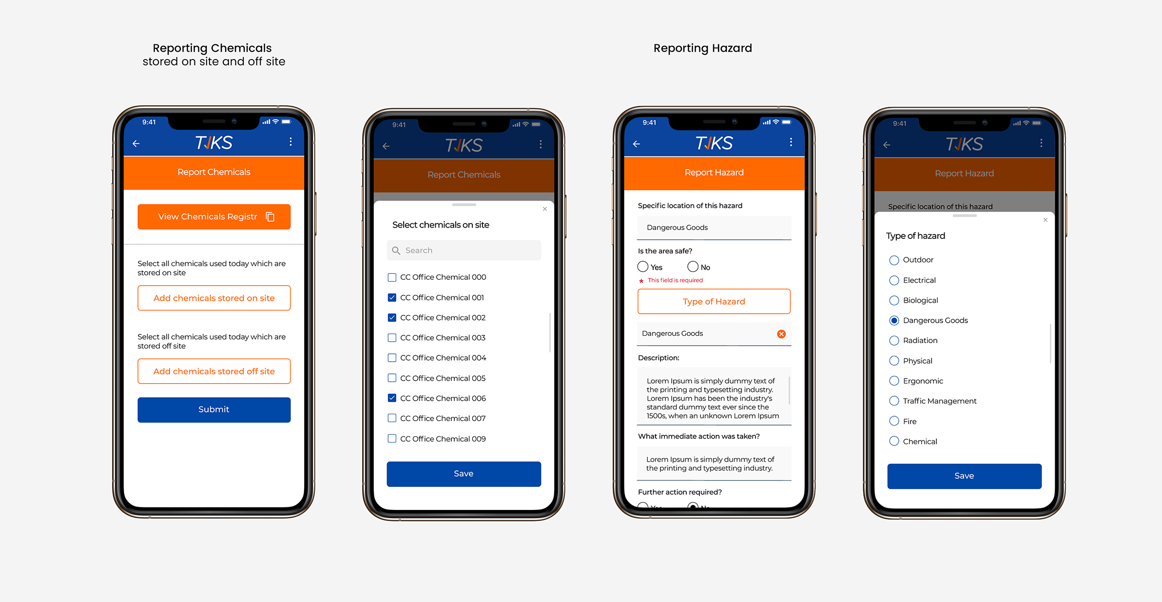
After presenting the interactive prototype to the team, I applied minor changes to the design. In the implementation phase, I worked with a backend developer.
I started implementing the frontend code of the design via HTML, CSS, Vue JS and created reusable components which I used in different screens.
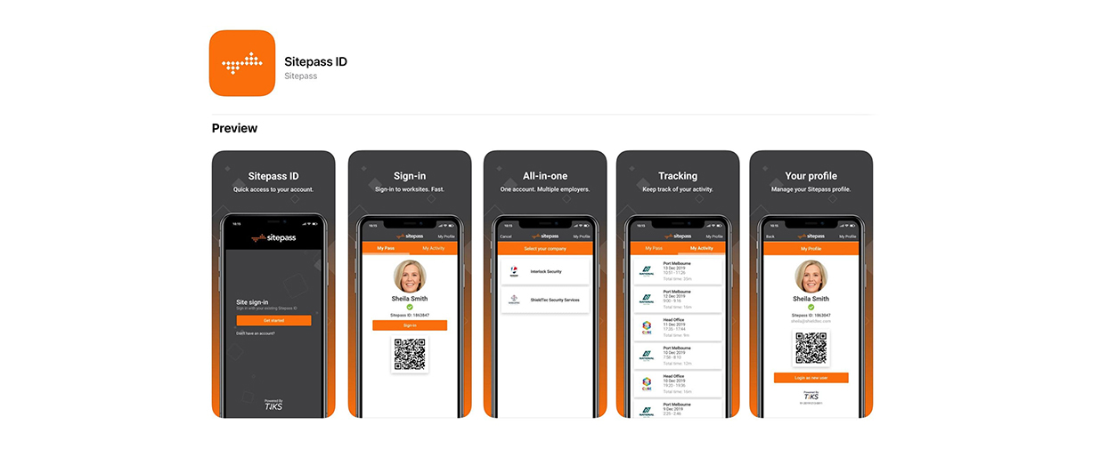
The first client that we presented the app for, with the new design, called “Sitepass”. The customer was happy with the design and we launched this app with client branding. It's available through “Google Play” and “App Store”.
