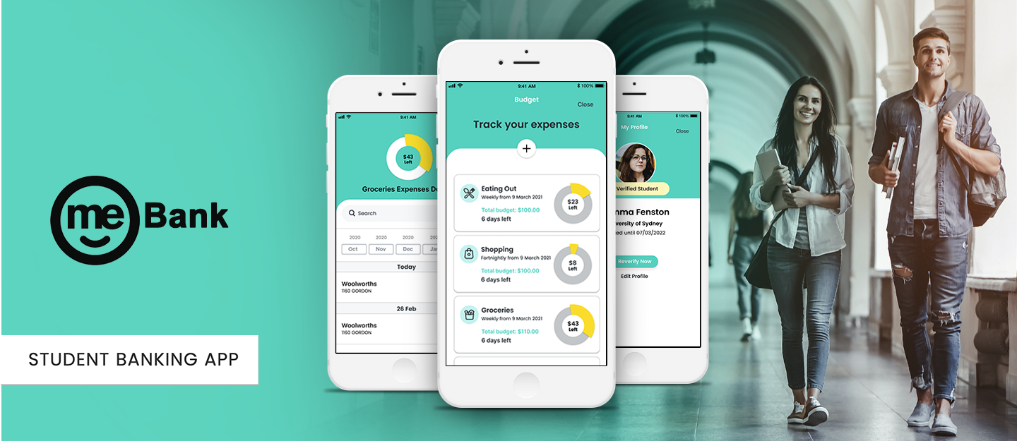


How might we help students to feel better about managing their money?
Our target audience was students cause they don’t proactively look after their money and therefore, prone to financial anxiety.
Client: Me Bank
Project Date: 29/02/2021
Duration: 2 weeks
Design Tools: Miro, Figma, Optimal Workshop
Platform: iOS Application
Deliverables: Research, Information Architecture, Sketching/Wireframing/Prototyping, Usability Testing
Team Mates: Fiona, Leila
We decided to choose the ME Bank as they have more room to grow compared with a well-established bank.
ME Bank is a Neo Bank and doesn't have a physical “brick and mortar” building. As they are an online bank, we believe that they can bring a fresh approach to banking. On top of that, ME Bank has already established itself as having a quirky and fun branding that appeals to younger customers.
As a team of 2, Fiona Fong and I were constantly collaborating and bringing together our research findings and synthesising the information as a team.
To cover the most we could in such a short period, we decided to collaborate equally in each phase such as interviews, workshops, card sorting, personas and ideation. The main sections of the project that I had more contribution to were UI design and testing.

We interviewed 15 people who are currently still in uni, those who have recently graduated or young adults. We asked questions about how they manage their money and track their expenses.
Students mentioned being anxious about not having enough money in their accounts.
Gemma is leaving the nest and needs to manage her money for the first time
In order to find out if our solutions already exist we started some competitor research.
We looked at some direct and indirect competitors to find out how they tackled this problem.
Here is the list of these competitors and some insight through searching on their products:
• Then we used the MSCW method to list and prioritize ideas & features that would help our users to achieve their goals. The most important features included:
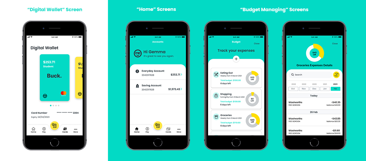
• A tool that helps users to create budgets for different purposes, track their expenses and stay on top of their finances
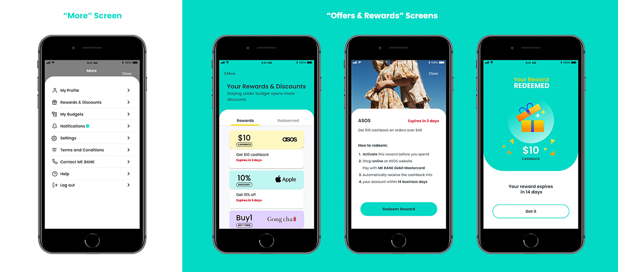
• Students discount & rewards on goods which would unlock inside the app for the student If they don’t go over budget
• A notification system that would notify students when they still have money left over and when they’ve unlocked more discounts
• The student verification process helps the app to identify users as students and unlock some… for them
We conducted a Card sorting activity with 35 participants. The result of card sorting was surprising. Because participants didn’t place features in the sections that the ME Bank app currently has them in. So based on the card sorting we have to change the IA of the ME Bank app.
I started the design process with low fidelity wireframes. For the first 7 rounds, I used a low-fi prototype testing. For the additional 5 testing sessions, I built a mid-fi UI to test the experience with users.
• Findings showed us that most people found the solution useful. However, there was a room for refinings in 2 areas:
Budget Managing Screens:
• Move the search bar inside each account so that they can search for individual expenses
• Users wouldn't be able to transfer money from one budget into another if it was running low
• User needs to know when the budget started, how many days left and the initial total budget
• Users often were confused with some “budget tracking” icon
• Users couldn’t identify how much money is left - enlarged circle chart section
• Users wanted to move incorrectly categorised transactions to different accounts
• Some of the content has a legibility issue, users didn't feel convenient to read it
Offers & Rewards Screens:
List of improvements for Offers & Rewards section includes:
• Adding expiry dates of discount/ rewards available for the user in-app and sort by which was expiring sooner
• Added the redeemed buttons to navigate users to the redeemed rewards screen
Once I tested out all usability mistakes, I started creating a design system and applied that to our UI design to keep the consistency in all the screens. I also checked the colours to ensure they would pass the Accessibility standards.
We tested our design with more users. They liked the solution and found it easy and engaging.


We believe this solution would help students to manage their anxiety about money. On top of that, using provided discounts and rewards would be a great opportunity for a financial brand like ME Bank to manage students finances, gain their trust from a younger age and create future loyal customers.
As it was my first finance project, I learnt so many financial concepts while I was working on this project and interviewing users. Before that, I was assuming that I should have accounting experience to be able to design complex products such as banking apps but I decided to be a good listener to learn about users needs and frustrations.