Building a Tokenized Design System
A self-initiated project exploring tokens, theming, and scalable component thinking from scratch
Time
Self-paced learning initiative
Role
Senior Product Designer
Team
Independent project
Platform
Figma / tokenized design system
Context
I wanted to challenge myself to build a tokenized design system from scratch, because I believe true design system thinking comes from doing the work, making the decisions, and facing the complexity firsthand.
Project Goal
This self-initiated project was an opportunity to deepen my understanding of tokenized design systems and explore how foundations, components, and reusable rules can work together as a scalable system and also understand how primitive, semantic, and component tokens relate to each other.
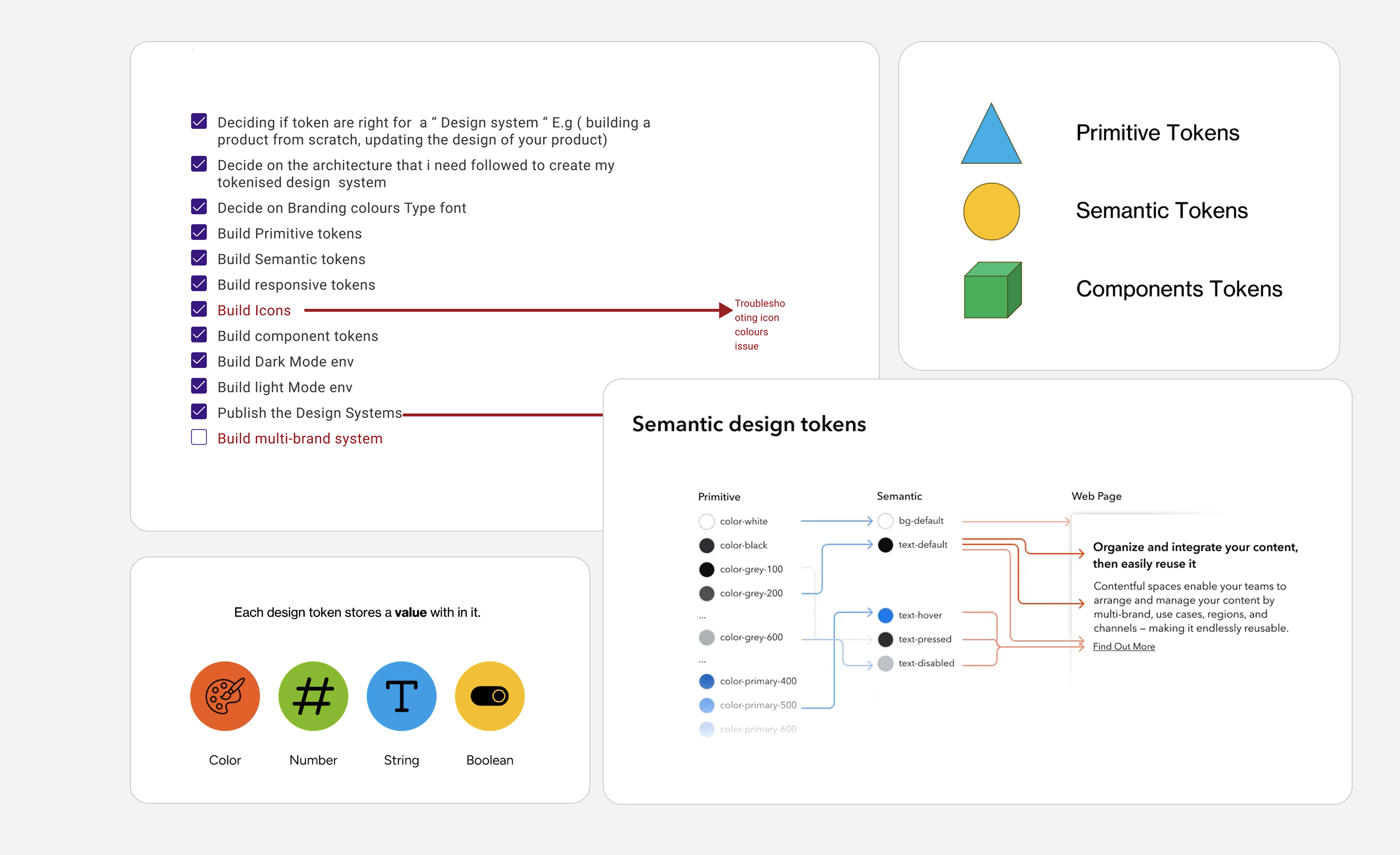
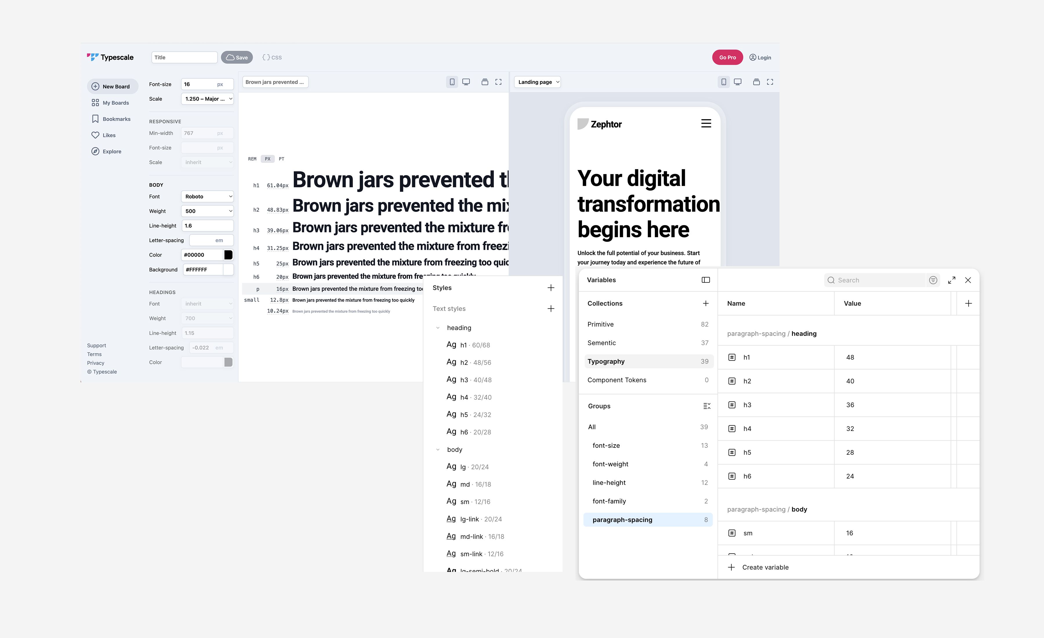
Token Architecture
I started by exploring whether tokens were the right foundation for the kind of system I wanted to build. From there, I structured the system into primitive, semantic, and component tokens to create a clear relationship between raw values, meaning, and real UI usage.
Primitive tokens
The raw values of the system, such as colours, spacing, type sizes, and radii.
Semantic tokens
The meaning layer that translates raw values into roles like text, surface, border, or status.
Component tokens
The layer that connects token logic to real UI patterns and reusable component behaviour.
Process
Design system architecture
Creating a checklist of the steps that i need to take or consider to create a design system
- Explored when tokens are the right foundation for a design system
- Reviewed how token structure improves consistency, reuse, and scalability
- Defined the logic I wanted the system to follow before creating components
- Structured the system into primitive, semantic, and component token layers
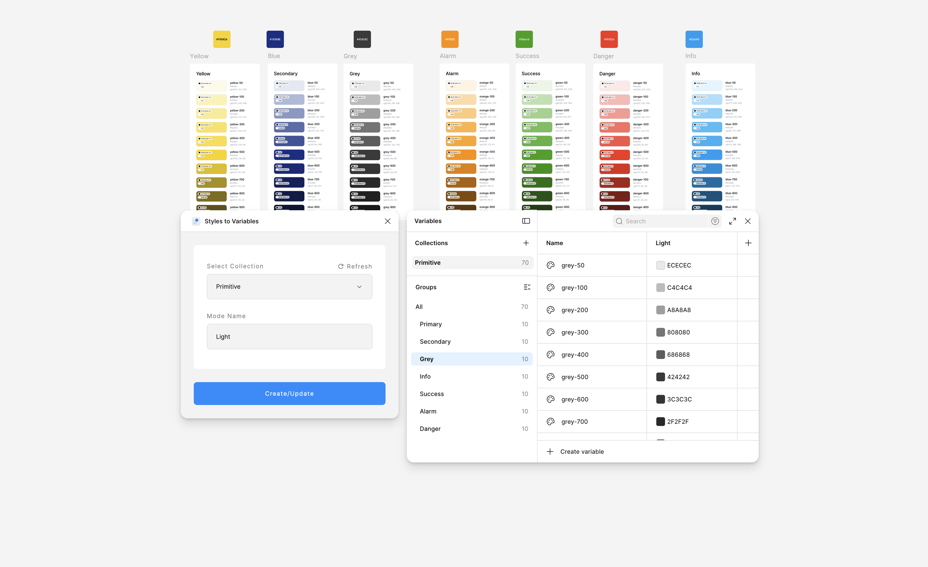
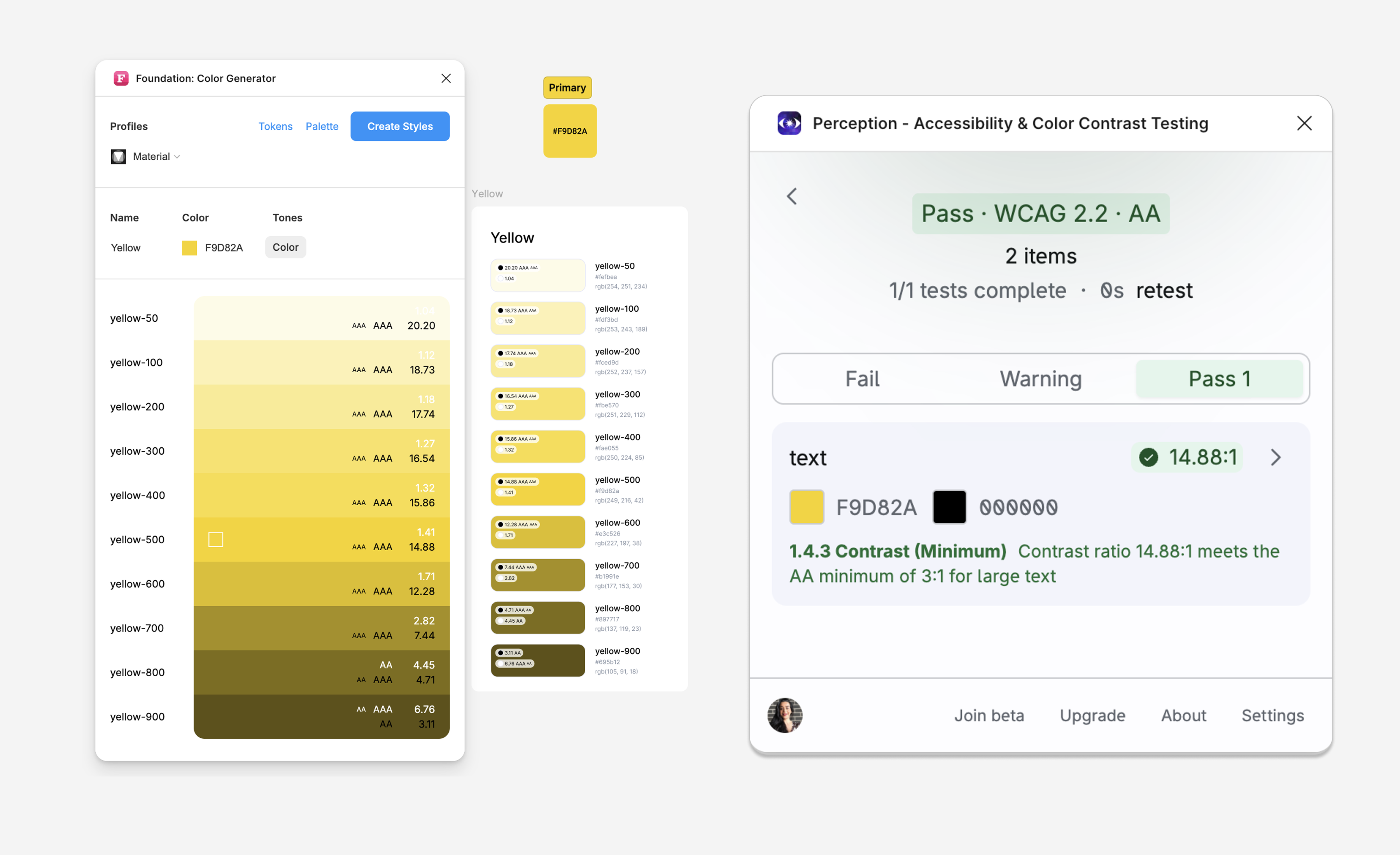
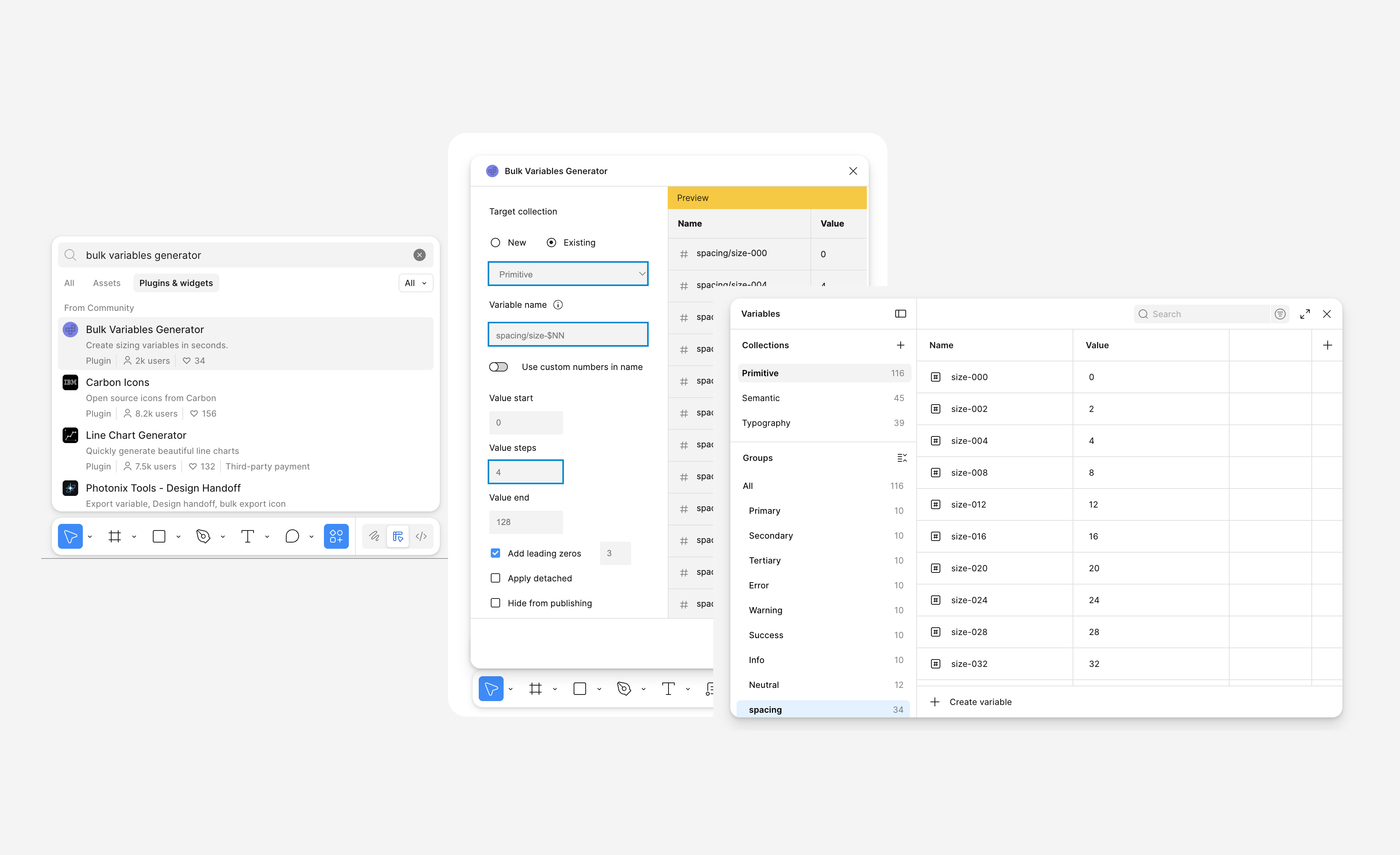
Creating the primitive and semantic tokens
- Mapped colours, typography, spacing, radius, and foundations into reusable token logic
- Used tools & plugins to fast track the process
- Considered the accessibility of variables like colours or etc during the tokenising process
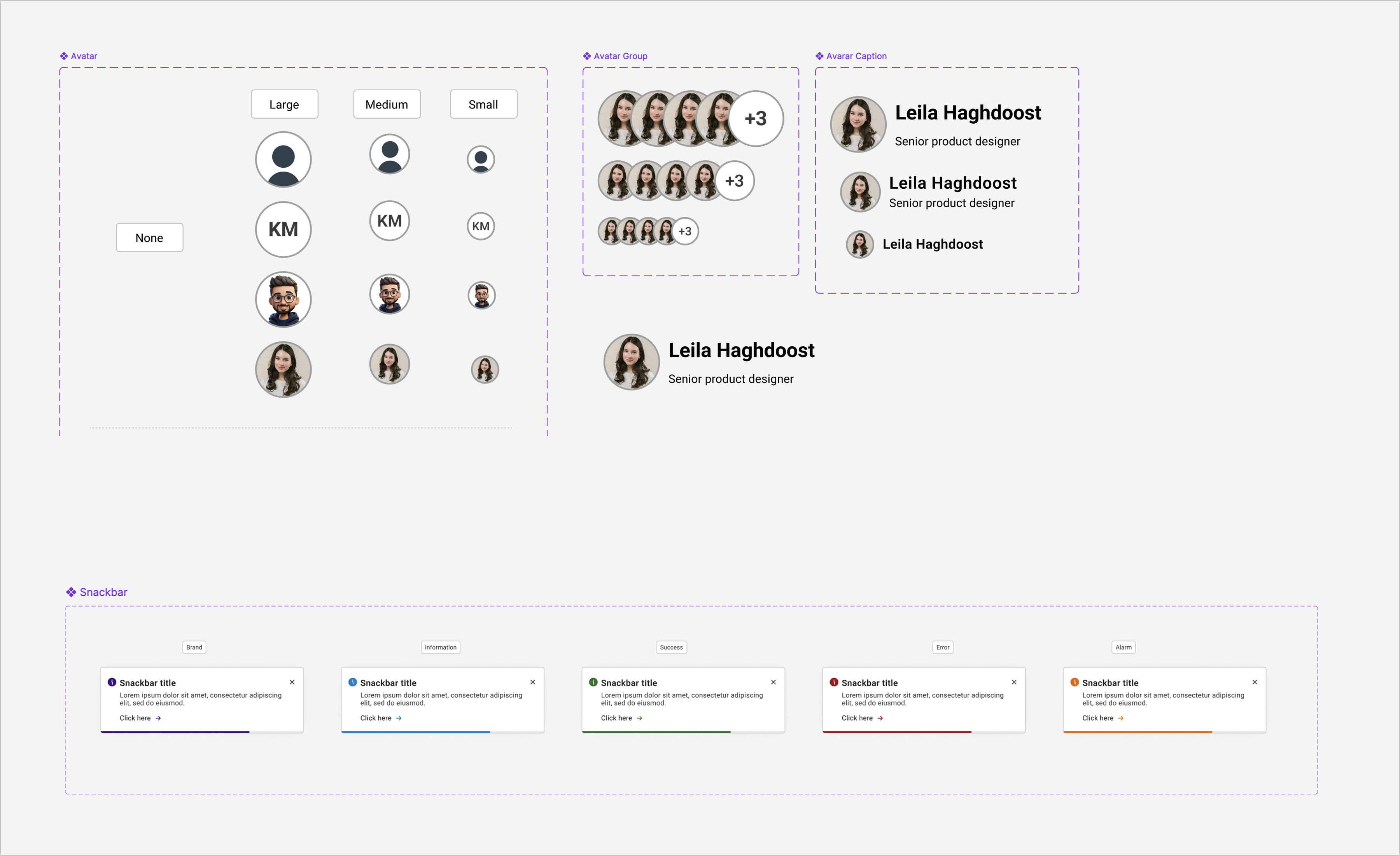
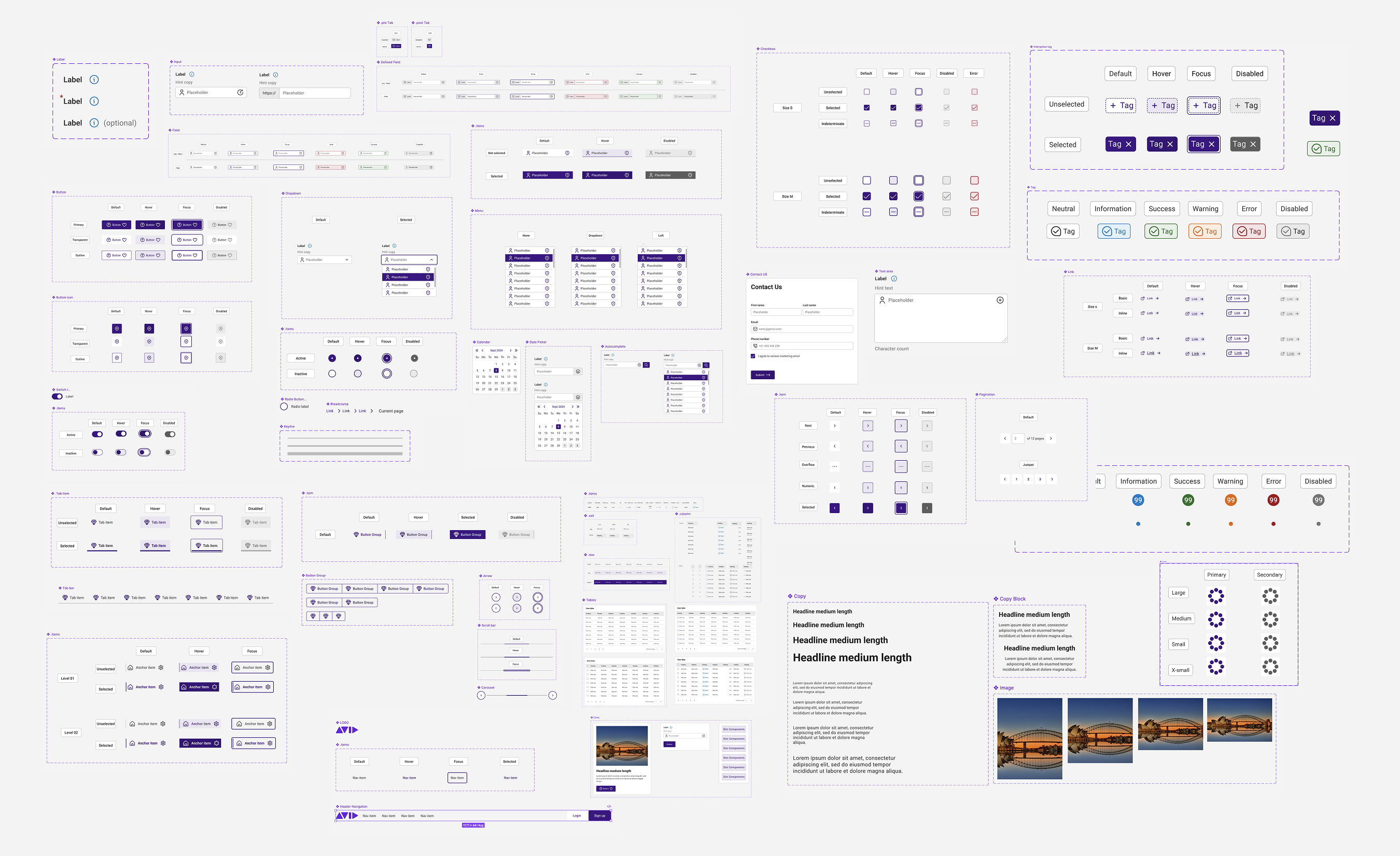
Components
Once the foundations and themes were defined, I moved into creating components. This stage helped me think more carefully about states, consistency, and how reusable patterns should behave inside a system rather than as one-off UI solutions.
Building components on top of the token foundation made the design decisions feel more intentional and easier to scale.
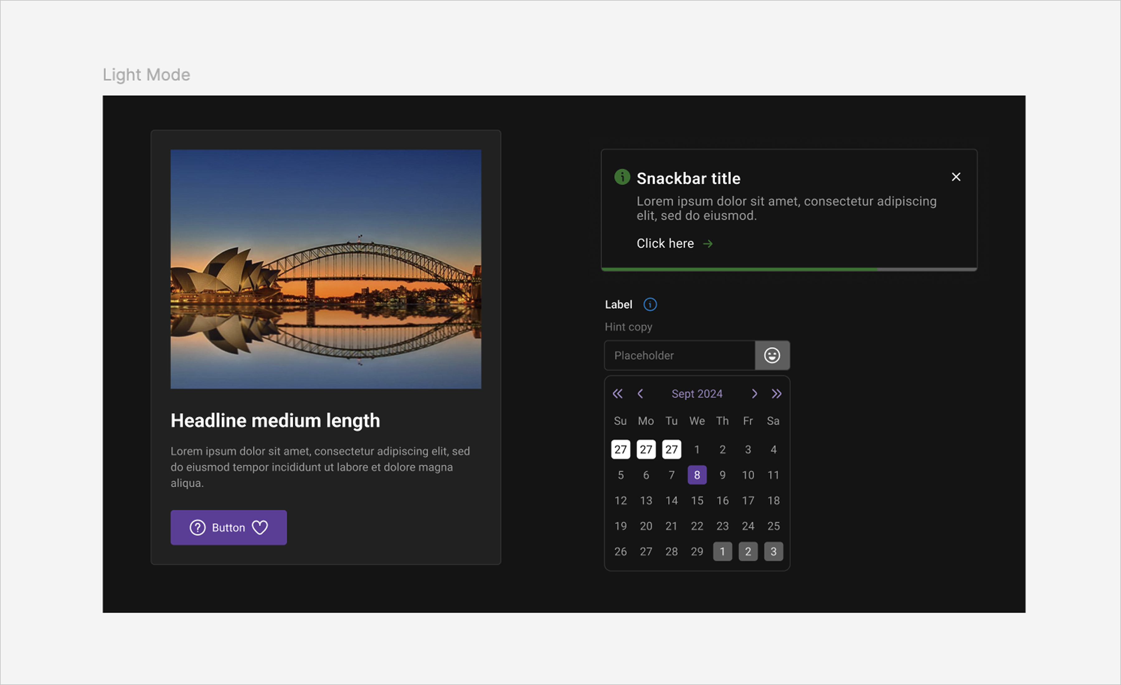
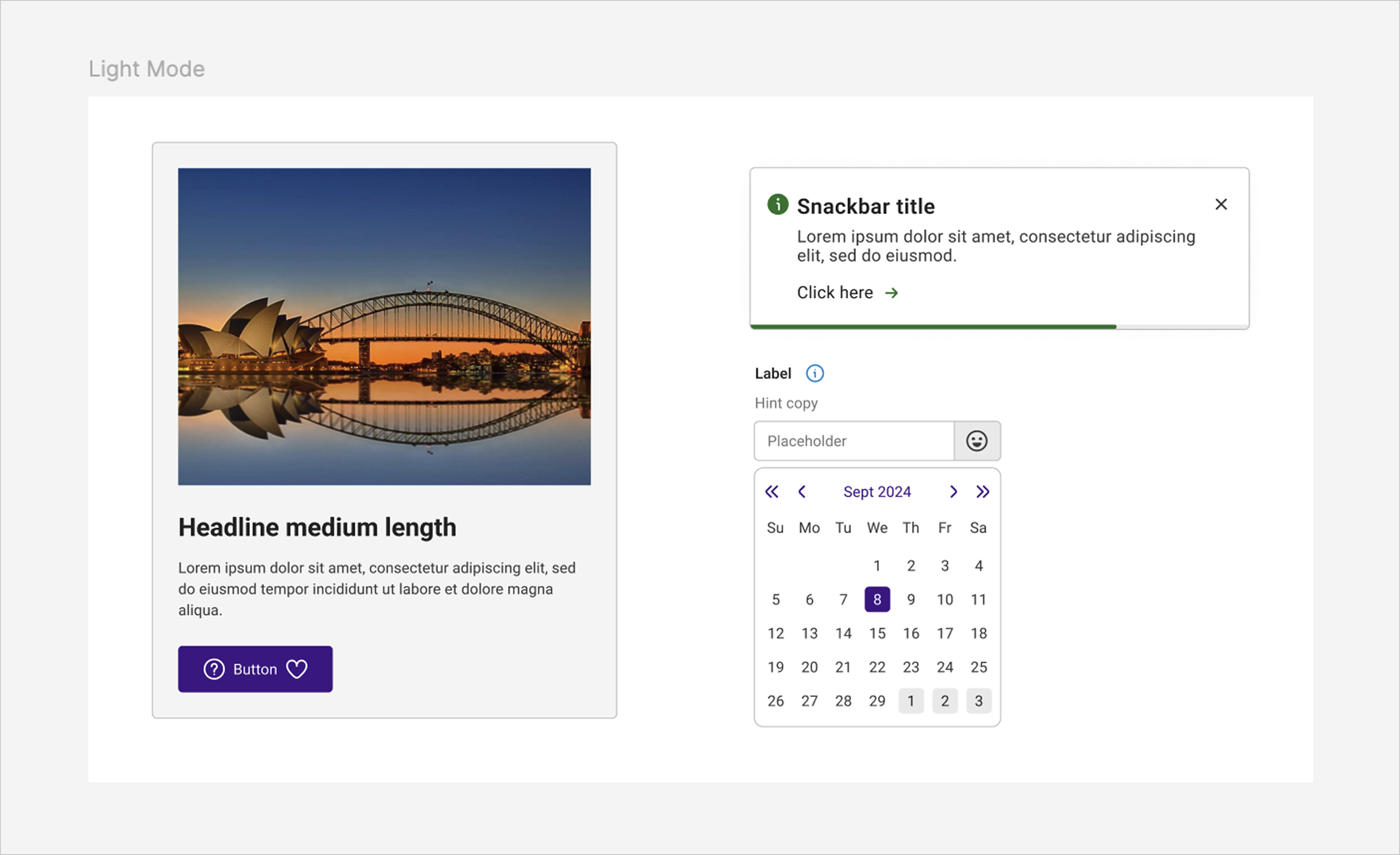
Light & Dark Mode
After the token structure was in place, I extended the system into light and dark themes. This was an important step because it tested whether the semantic layer was strong enough to support different visual modes without rewriting the system from scratch.
It showed me that theming is not just a visual layer. It depends on having clear, meaningful tokens that can adapt across different contexts while keeping the same design logic underneath.
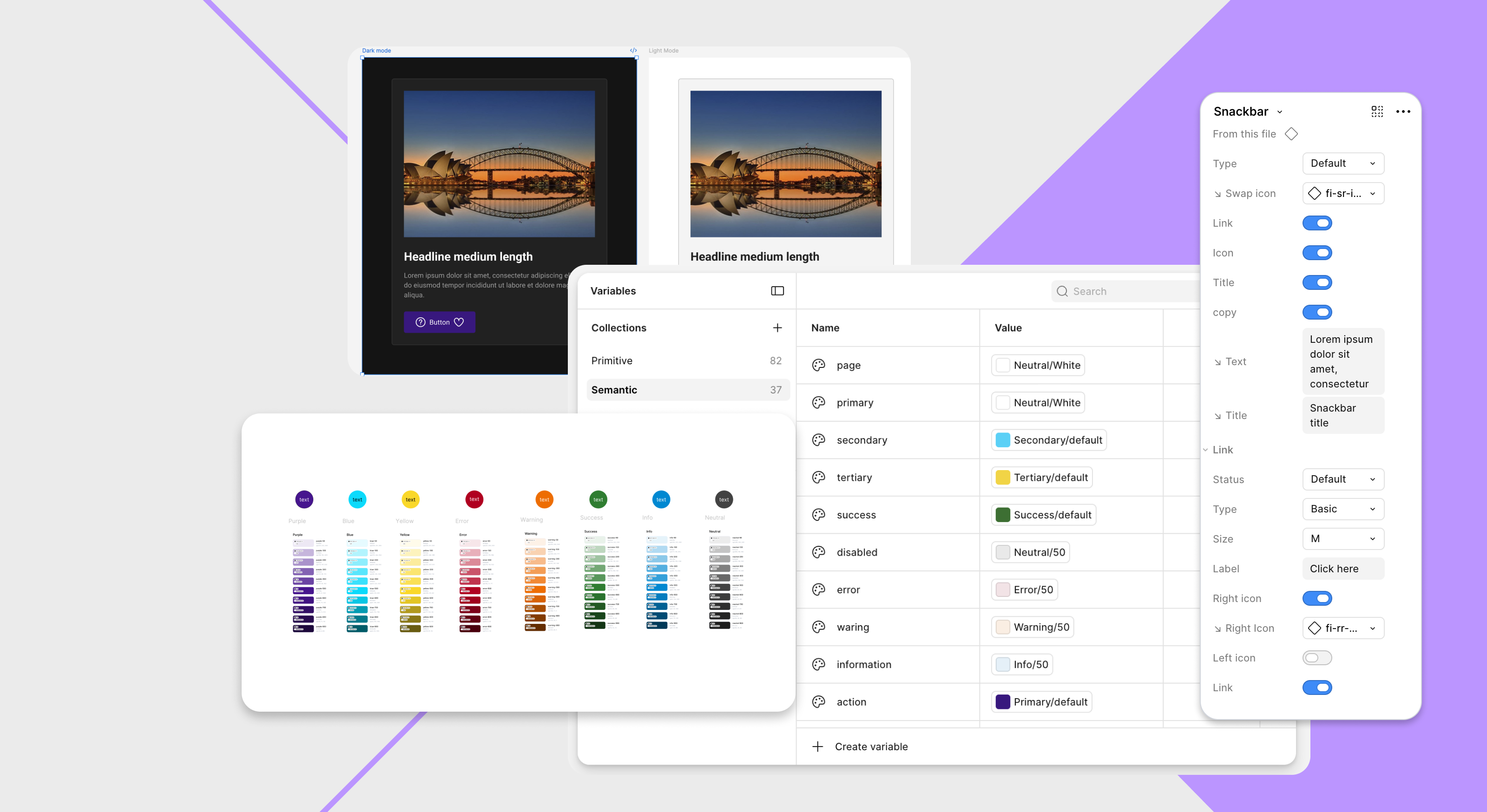
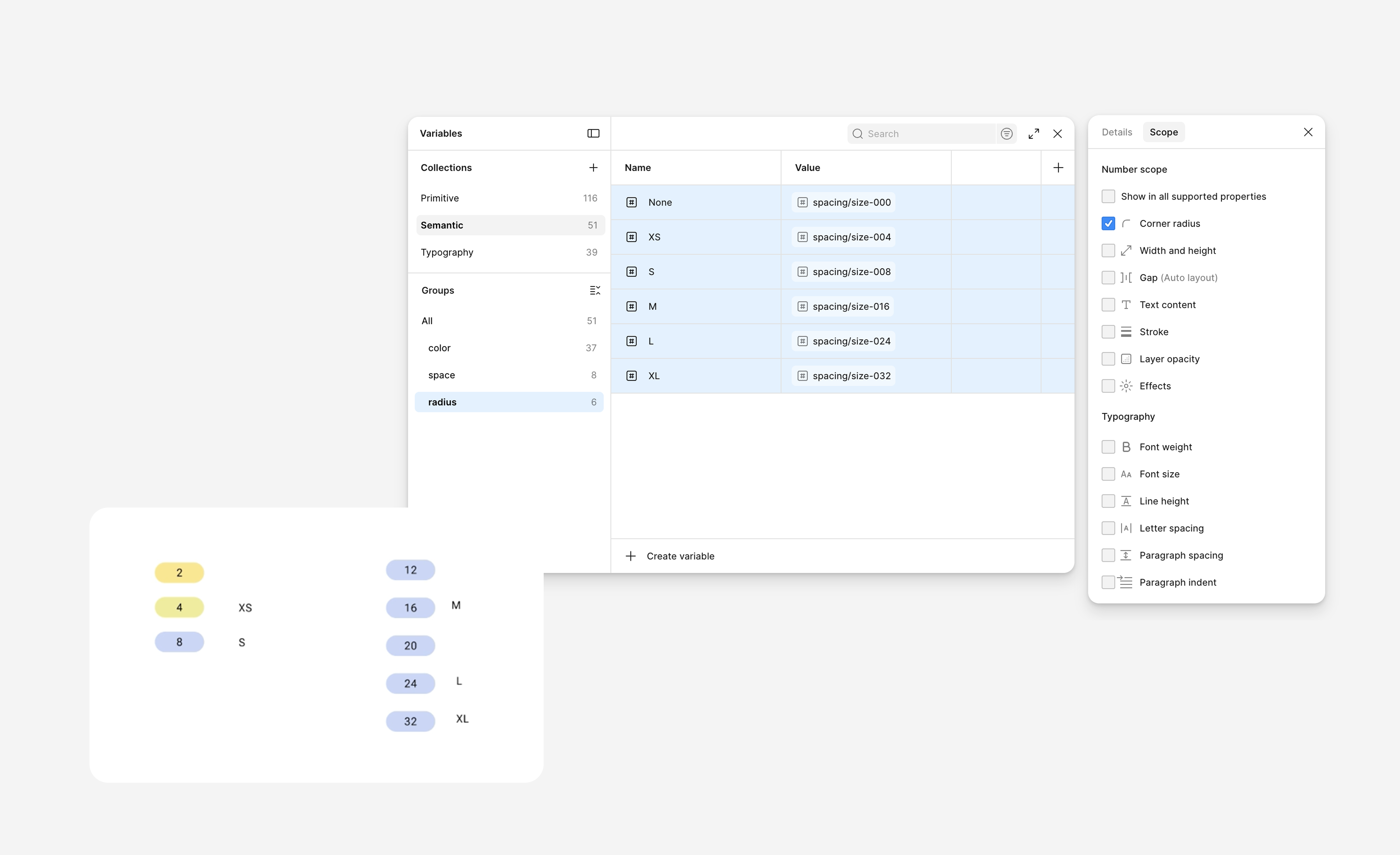
Publishing the design system
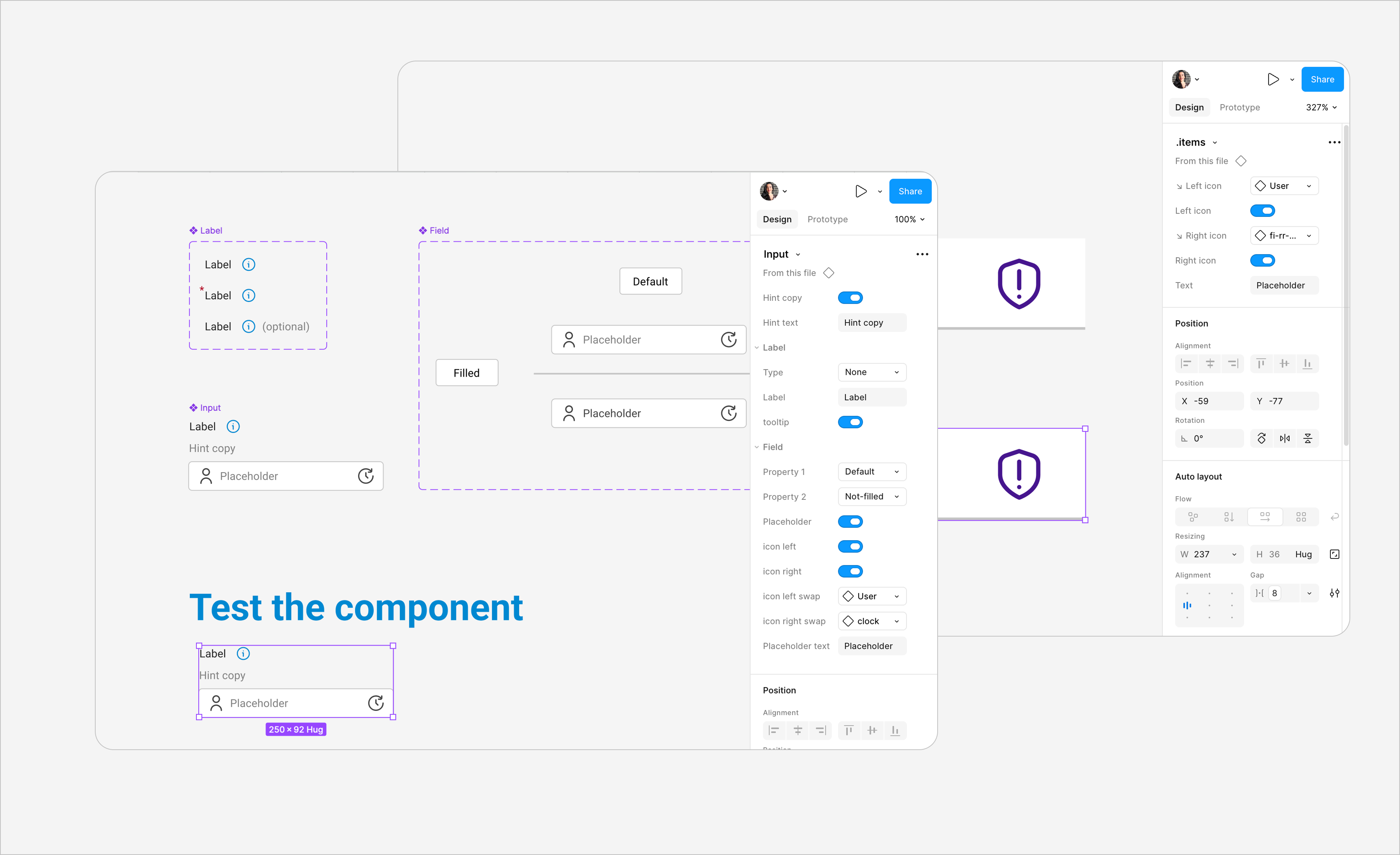
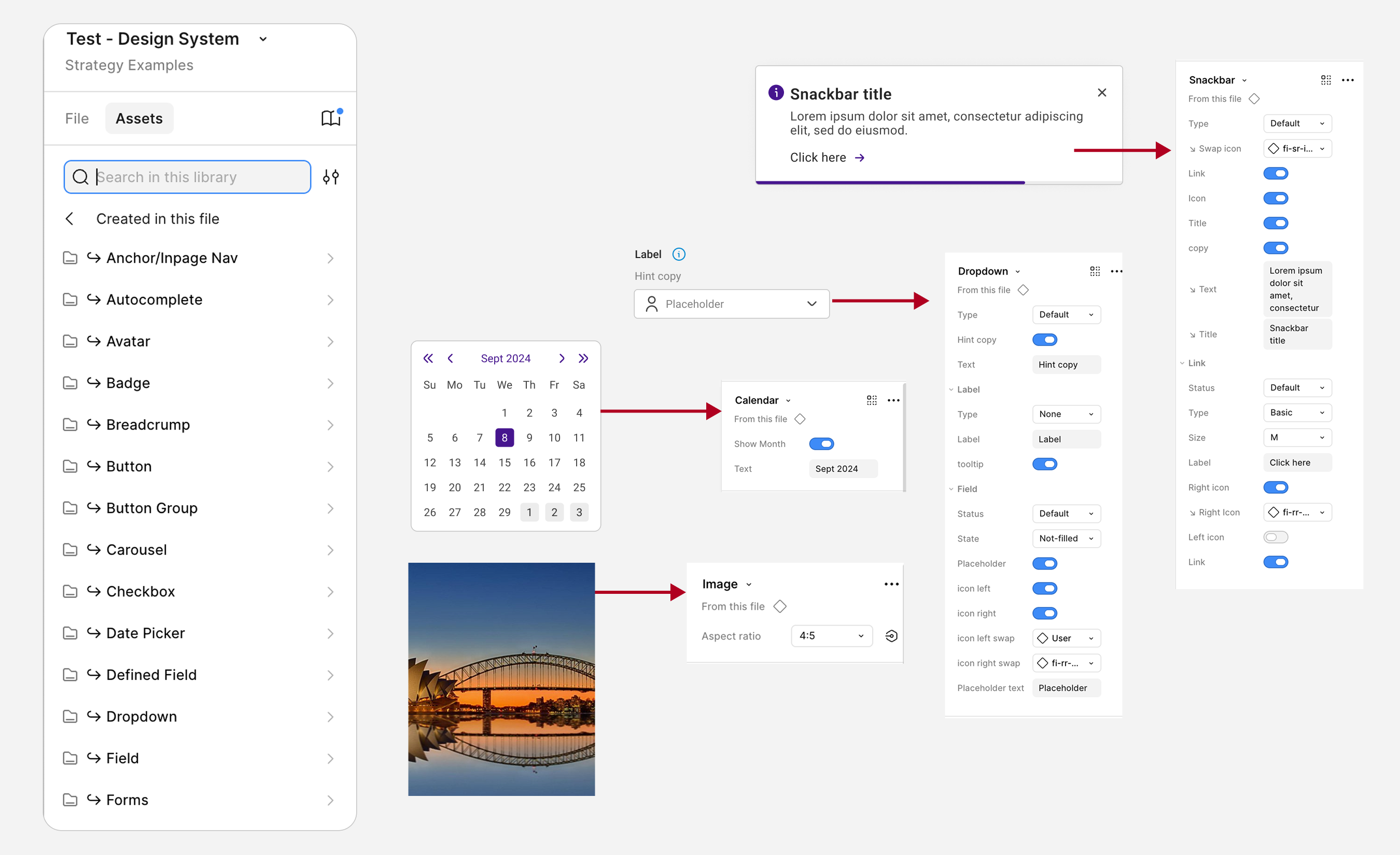
Once the foundations, themes, and components were in place, I moved into publishing the system so it could function as a usable library rather than just a working file.
As shown in the image below, I tested the properties I had created for each component and made sure the nested properties were also available and structured clearly. This helped make the variables easier to use and the system more reliable as a reusable library.
Publishing the file helped turn the project from an internal exploration into something more organised, reusable, and easier to maintain.
Challenges
Naming with clarity
One of the hardest parts was creating token names that were clear, scalable, and not too tied to one visual outcome.
Balancing structure and flexibility
I had to make the system structured enough to feel consistent, while still leaving enough flexibility for real component use.
Thinking beyond visual UI
This project required me to move beyond polished screens and focus on the architecture behind them.
Reflection
This project strengthened my ability to think in systems rather than individual screens. It gave me a much deeper understanding of how foundations, token logic, theming, and components work together as one connected structure.
More than anything, it helped me build confidence in approaching scalable design work with more structure, intention, and clarity.